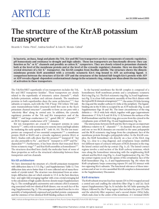
Reading blogs about scientific publishing can be a sobering experience. Peer review is broken; publishers are evil; papers are evaluated by the wrong metrics; and the data is probably faked anyway.
The positive moments are too easily forgotten. For one, there is the initial relief when you first submit your paper. Suddenly, your vague ideas or unsolved problems from a year ago have materialized into something substantial, something worth communicating to the world. And of course, there’s the excitement when your paper finally gets accepted for publication.
But this post is about another, more subtle happy moment in the lifecycle of a paper: it’s that email you get, when the production team sends you a PDF and you first see your paper in its typeset form. This the final form with which your work will enter the scientific record. And, it’s beautiful!
We believe that a scientific paper can be a thing of beauty in its own right. Which is why for our inaugural post, I opened the archives and took a closer look at the design trends and beautiful papers from the past 350 years.
Pioneers in the 17th century
The first journals to publish scientific papers on a regular basis were the French “Journal des sçavans” and the English “Philosophical Transactions of the Royal Society”. Both journals started within a few months of each other in 1665, in what at first glance may look like a concerted effort to disrupt the publishing landscape of the 17th century. The strategic goals of the two journals were a bit different though, as pointed out by Jean-Claude Guédon in the introduction to his piece “In Oldenburg’s Long Shadow”. The Sçavans was a bit gossipy and published more science news than original research, while the Royal Society publication took a more purist approach.
However, the two journals were very much in accord on how a scientific paper should look. I assume technical constraints and the state of the art in typography at the time naturally led to these decisions. Two papers from 1669 show a small, one-column layout, with similar typography that makes use of italics and drop-cap initials.
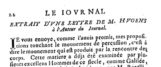
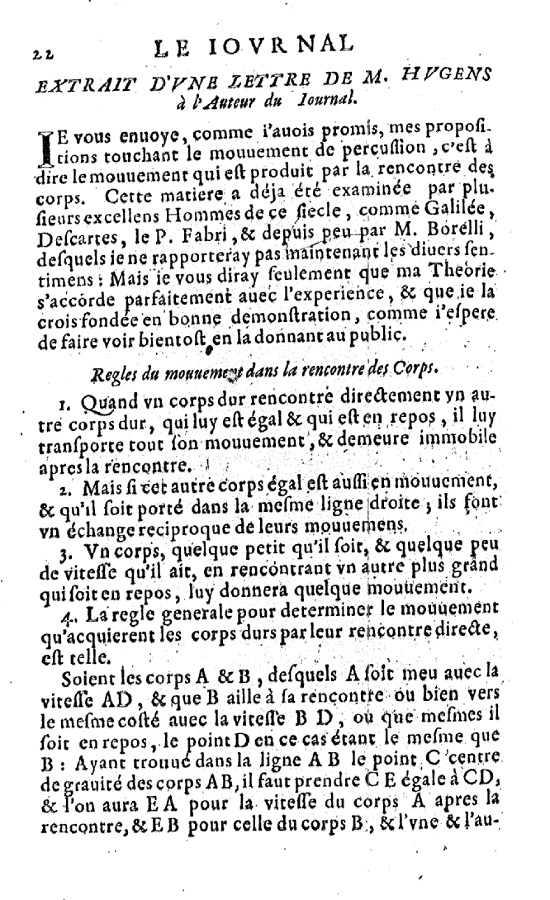
Journal des sçavans 1669
Phil Trans 1669
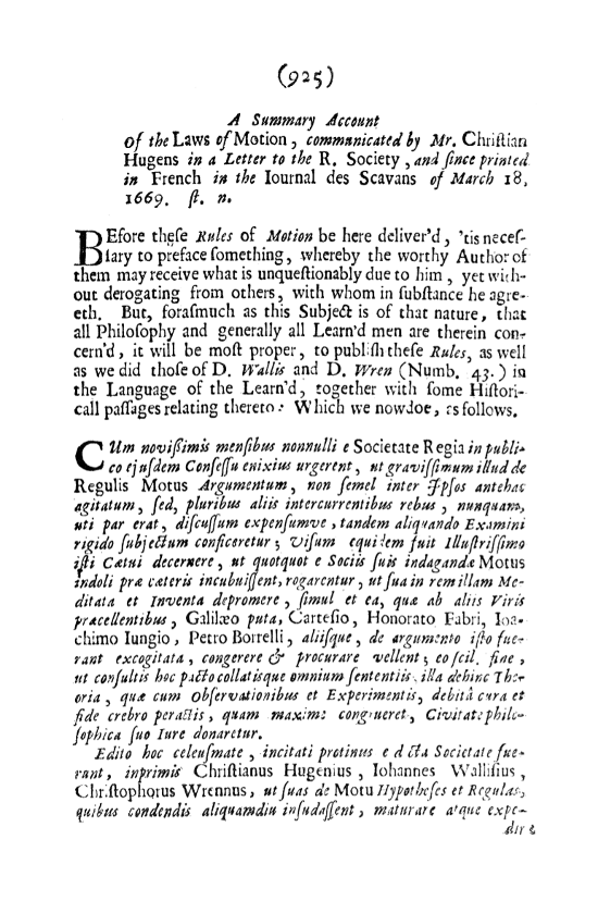
You may have noticed that both papers have the same author, Christian Hugens. Actually, they are the same paper. His work on the the laws of motion was first printed in French in the Journal des sçavans, then reprinted in Latin in Phil. Trans. Clearly a smart move by Hugens: He wrote one paper and could write in his CV that he has published in all scientific journals.
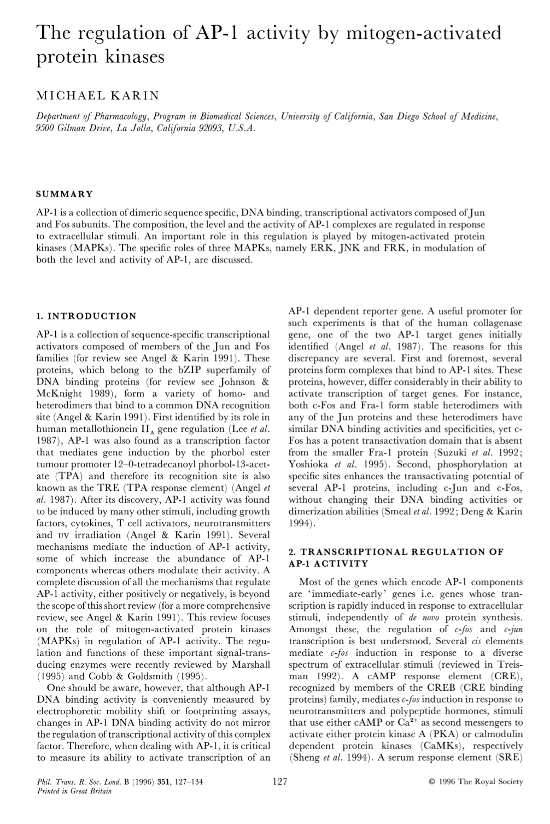
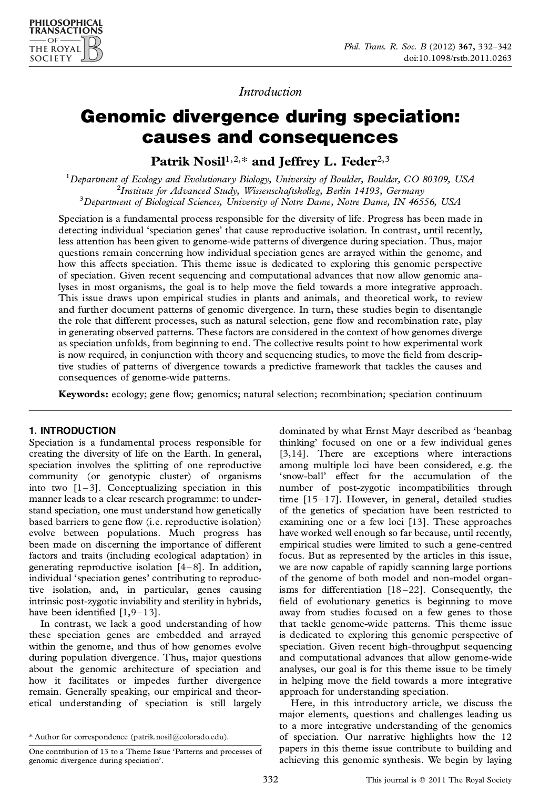
One re-design per century: 350 years of Phil. Trans.
While the Sçavans disappeared very soon during the French revolution, Phil. Trans. was here to stay. It was split into two sub-journals A and B in 1887, but nevertheless is the longest running scientific journal. Which makes it an ideal starting point for us to trace journal design trends through time.
Spend some time looking through the Phil. Trans. archives and you’ll learn what many people have noticed in a different context: scientific publishing moves slowly. There have been only a few major redesigns in the past 350 years, including a change to a bigger page size in the 19th century and a switch to a two-column layout in the 20th century, leading us to the modern design of Phil. Trans. today. During the early years in particular, not much changed at all. One might be tempted to blame conservative decision makers in a setting like the Royal Society: “Guys, let’s not rush this here, we already changed the typeface 100 years ago”. But perhaps the trends we see here are simply a reflection of fundamental changes in printing technology and typography throughout the ages.
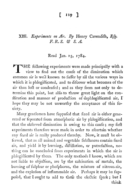
One minor but long-lasting detail is the somewhat uncommon way that the page number is printed in brackets centered at the top of the page. The bracket numbering appeared in the first years of Phil. Trans. and lasted all the way to the 1970s. It’s fun to imagine that in the 1660s a typesetter with lead letters in a dark workshop made the decision to print it that way, and somebody in the 1970s (probably in bell-bottoms) says “That’s a good idea, let’s keep that.” Talk about having a lasting impact on science!
Phil. Trans. 1784
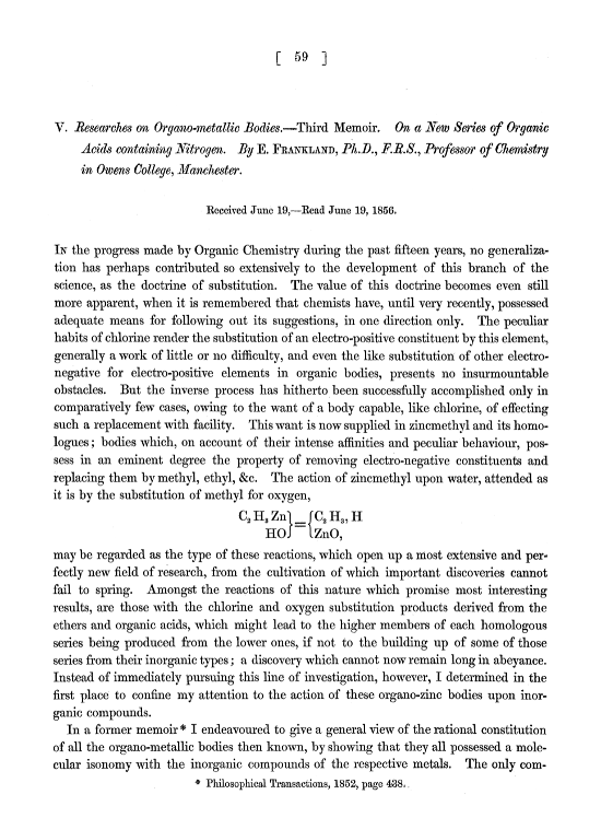
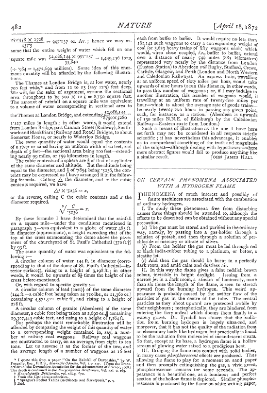
Phil. Trans. 1857
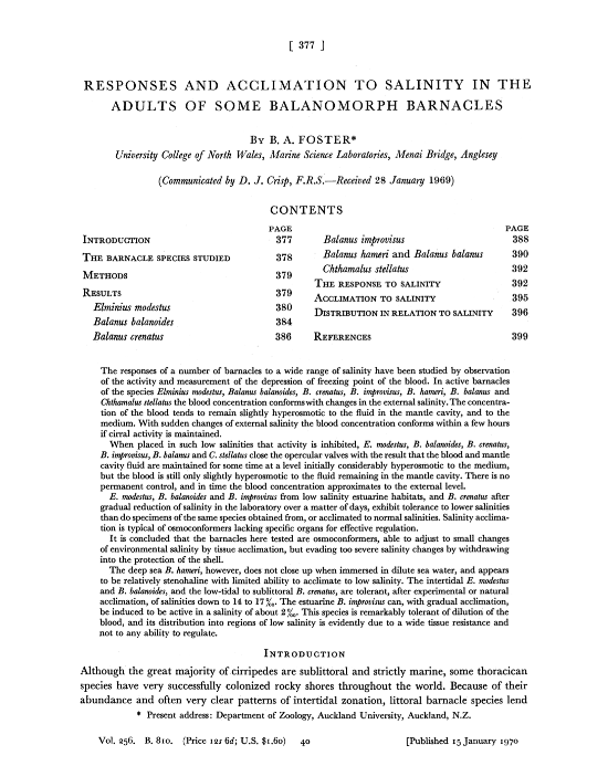
Phil. Trans. 1970
Phil. Trans. 1996
Phil. Trans. 2012
PNAS: simple and classy for 100 years
Let’s move away from Europe a bit and see if papers looked differently in the US during the same period. PNAS was established in 1915, so I could analyze the designs across roughly a century’s worth of issues. This example from 1919 shows similarities to the contemporaneous Phil. Trans. papers with a relatively dense, one-column format. I noticed that the look of these papers felt surprisingly familiar to me, although I rarely read such old papers for my research. I suspect this is because of the typeface — this early 20th-century typography is similar to the default typeface for LaTeX manuscripts, which in some fields are ubiquitous.
PNAS also had two major re-designs. The change to the two-column layout in the 1970s led to the format probably everyone is familiar with, since PNAS covers many different fields of science and this particular design was used for more than 30 years. Only one more major redesign led to the current look of PNAS (More on contemporary paper design in a minute.)
PNAS 1917
PNAS 1966
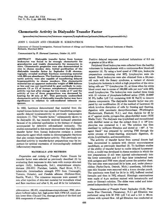
PNAS 1974
PNAS 2003
Nature: staying in style since 1869
Next I looked at almost 150 years of Nature papers. Here we see more frequent changes, and it seems that Nature tried to stay ahead of design trends more than the Royal Society or the National Academy of Sciences. The example from 1955 already looks surprisingly fresh, with a heading in a sans serif font. Over the next few decades we see typography variations, mainly in the headings, and various attempts to better organize the page with horizontal lines.
Nature 1872
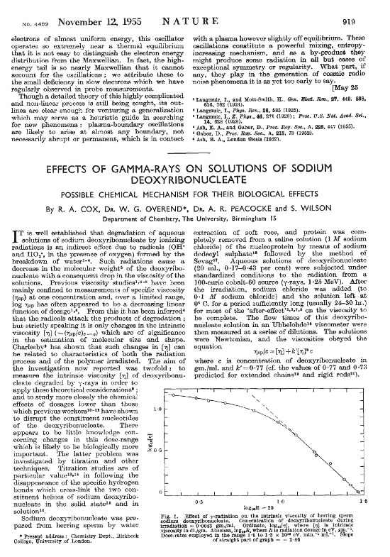
Nature 1955
Nature 1975
Nature 1984
Nature 1995
Nature 2001
Nature 2013
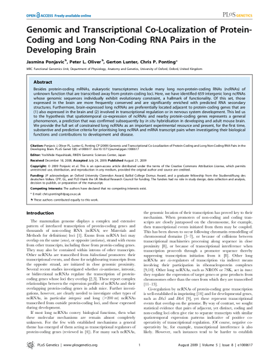
Contemporary paper design - lets add some colors
It’s clear from the preceding examples that paper design has become much more rich in the past 10-15 years. New online-only journals in particular have pushed the state of the art. A current PLOS paper features colored text and organizes the page with shaded areas and boxes. The current design of a Nature article also makes subtle use of color in the typography. Subheadings are shown in blue and the abstract is set in a shaded gray box.
PLOS Genetics 2009
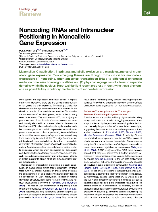
This Cell review from 2007 is one of my personal favourites. It uses just one typeface, and with plenty of whitespace and courageous use of colors it looks cleaner and fresher than anything else I’ve seen. Although the design is very different, it stays true to its nature and there is no doubt that this is a scientific paper. Elsevier did a great job here (a sentence that you don’t hear very often these days).
Cell 2007
The future of publishing - electronic “papers” on the web
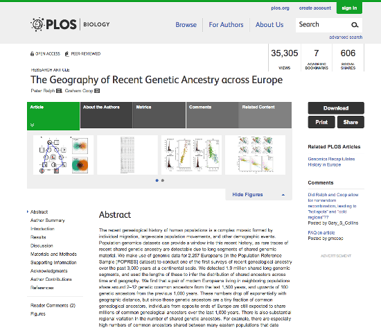
With journals moving away from print altogether, the future of the classical paper is uncertain. As long as we print PDFs, the classical format of a print paper will remain. But for how much longer will we print PDFs? Presenting research on the web will become more important — this medium opens up entirely new possibilities, and we see beautiful examples of journal websites like PLOS Biology with state of the art web design and interactive features. And I’m excited to see completely different approaches to presenting research, such as eLife’s lens or NCBI’s PubReaderBut at the same time, it feels strange to be talking about website trends after looking through an archive of 350 years’ worth of scientific papers. In that timescale, the web is simply too young to put into context.
PLOS Biology website 2013